Tuesday, October 23, 2007

Heckling Hare construction drawing

Much thanks to John K for his instructive videos on the finer points of construction while drawing freeze frames of good cartoons. Here's my attempt.


Even before any critique, i notice a few places i went wrong. For starters, i didn't get the angles of the base shapes for the dog correct. Also on both Bugs and the dog, the tufts of hair gave me a lot of trouble. The wrinkles i feel are so so. They follow the forms to a degree. Perhaps they might have looked better if i had drawn larger. I probably should have drawn Bugs and the Dog on separate pieces of paper to really let the construction lesson sink in. I might do that after i get this damn uni assignment out of the way. I wanted to draw the framing of the two, but that didn't necessarily work out as expected either. Ah well, not a bad attempt for the first real drawing i've done in months. =/
Wednesday, February 28, 2007

Gonna try and update more often

Heya to the few people that might actually check this blog!

I haven't posted for a very long time. I've still been drawing lots though. I think i shall try and just start scanning and posting the stuff i'm doing. I've been neglecting the last 2 (now 3) lessons and i need to get back to them sometime soon, but there's lots of other stuff i've been trying.

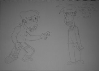
Here's something i just drew to battle my insomnia. I watched the "Mad Dog Hoek" episode of Ren & Stimpy which inspired it.


I took a photo cause this sketchbook is too big to scan with my dinky scanner.

These are two characters i wrote an animated pilot for last year. I haven't drawn them in a very long time. It shows!

Aw well. I'll try and post some charactures i've been drawing soon.

Saturday, October 28, 2006


This was just me cracking out my colour pencils and having some fun. I haven't done that in a long time. I'm iffy on the colour job, but i love this character.

Friday, July 14, 2006

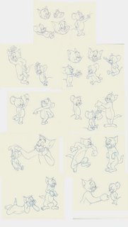
Lesson 7 - Being Generic while learning to draw

Man, it's been almost a month since i posted my last lesson. I've been a real slack bastard. For this lesson, i drew everything off a Tom & Jerry model sheet. I did this through the entirety of the last couple weeks so you can see where i've started drawing again after a while. It took me a drawing or two to warm up. Regardless though, my drawings got a lot tighter and more lively as i went on. I still have proportion problems but i'm forcing myself to check leg and arm placement through negative space as well as just looking. I'm steadily improving and i think some of the later Toms are the best on the page.


The lesson can be found here ASIFA-Hollywood Animation Archive Project Blog: Meta: The $100,000 Animation Drawing Course- Lesson 7

Friday, June 09, 2006

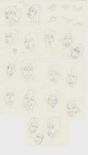
Lesson 6 - Katie Rice heads

Whoooee. This was tricky shit. It was like i was learning head construction all over again. You can see that there's a lot of problems with these.

The most trouble i had was with perspective and proportion. The space between face parts is off for a lot of the drawings, and the faces themselves are squahed and stretched wrongly. Eyes don't look like they're on a 3d head, but tend to float around the face. The noses and lips are ok. I'm somewhat happy with those. The jaws were interesting. I experimented a little with how to draw them when constructing the head. At the start, i made broad ovals and then sketched in the details. Later on, i actually draw the shape of the jaw descending from the skull. This seemed to work the best.

The hair was fun because it looks like the hair is draped on the drawing as an afterthought, but it ends up completing it. Even though these sketches of Katie's ooze style, and it was hard to keep up while learning the lessons hidden within, it was still fun and educational.

The lesson can be found here, ASIFA-Hollywood Animation Archive Project Blog: Meta: The $100,000 Animation Drawing Course- Lesson 6

Monday, June 05, 2006

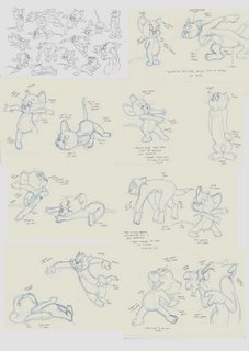
Line of Action, part 2

Here's the rest of the Tom & Jerry pics. There were a blast to draw! Tom & Jerry has always been one of my favourite cartoons, and being able to draw them was very gratifying.

I'm getting the hang of line of action. There are a couple good examples in the pics. Some of them i didn't push it far enough, and some have the curve off. It just shows you how important a proper line of action is for a drawing to show decent movement. I still had some trouble with body proportion but i managed to get better at it near the end (Tom's really threw me off for most of his drawings).

I'm also starting to understand the use of negative space. When trying to get a drawing to look right, it can be more important than trying to see if your lines are correct.

I might give the Disney and Clampett drawings a go later this week. I want to give those Katie Rice heads a go first.

The lesson can be found here, ASIFA-Hollywood Animation Archive Project Blog: Meta: The $100,000 Animation Drawing Course- Lesson 5

Saturday, June 03, 2006

Break Time!

So i got through about a third of the Tom & Jerry line of action drawings when i decided i needed a break.

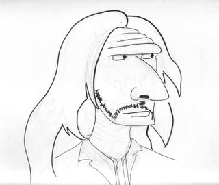
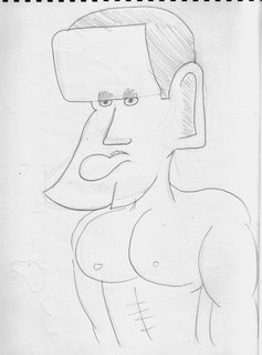
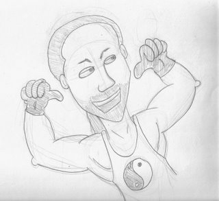
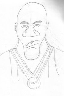
I started drawing some charactures of wrestlers from the WWE (I am a huge wrestling fan).


I think you can tell who this is if you're into wrestling. This was the 2nd characture i drew. The first one i wasn't happy with when i inked it, so i decided to draw it again from memory and really exaggerate the features. I also didn't ink it but instead used pencil. I like how it came out.


[edit] A friend of mine asked me to draw RVD for him after i showed these off. Here we go!


[last edit, i promise] Here's one more for ya. A certain olympic champion. Oh it's true! It's damn true!

Line of Action, part 1

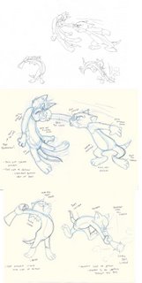
This is the first part of the line of action lesson. I just wanted to post something and perhaps get some feedback.

This is really challenging stuff. I spent a couple hours alone erasing and redrawing Tom punching the other cat. In the end i was satisfied it was in the ballpark, but upon comparing it with the original drawing, i still have a ways to go. I think the main problem with the other two is the body proportion. I also need to follow through with my line of action, and make sure i get the curves right.

I'll be paying more attention to the line and proportion when i complete all the other drawings.

The lesson can be found here, ASIFA-Hollywood Animation Archive Project Blog: Meta: The $100,000 Animation Drawing Course- Lesson 5